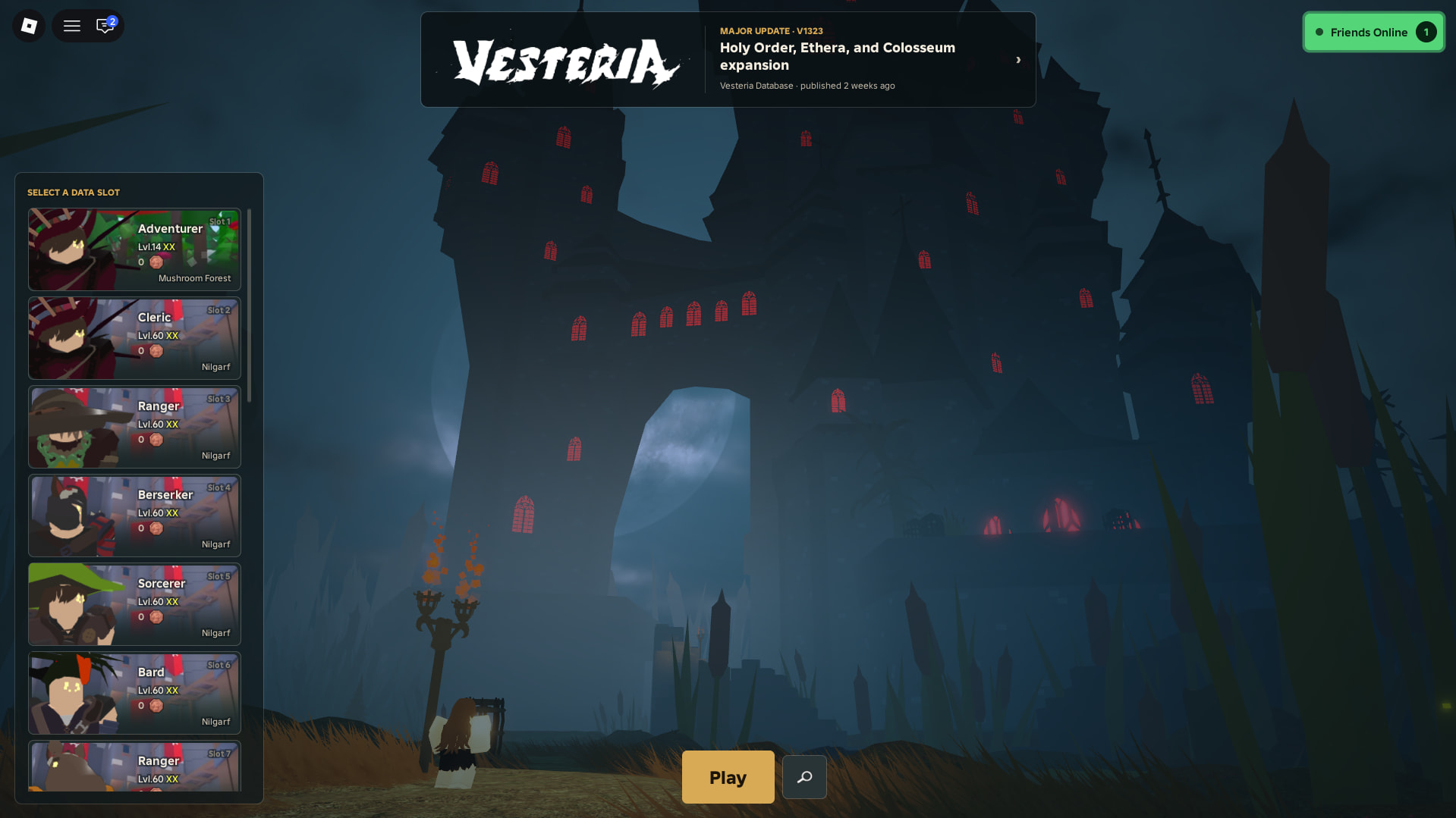
New features on the main menu are really sick (the friends tab, new character customization and database thing) the UI could just use some tweaks tho
- Revert the main menu loading UI back to the old one with a transparent backround, so a grey backround and the old V, this just changes the way it looks it still keeps everything like the option to teleport to a different lobby server if the current one takes too long to load, etc
- The blueish backround colour on the slots, character inspect, friends tab and database thing should be changed to the old grey colour, still transparent tho (on the slots and inspect) this colour doesnt really match any of the other vesteria UI and looks kinda weird imo
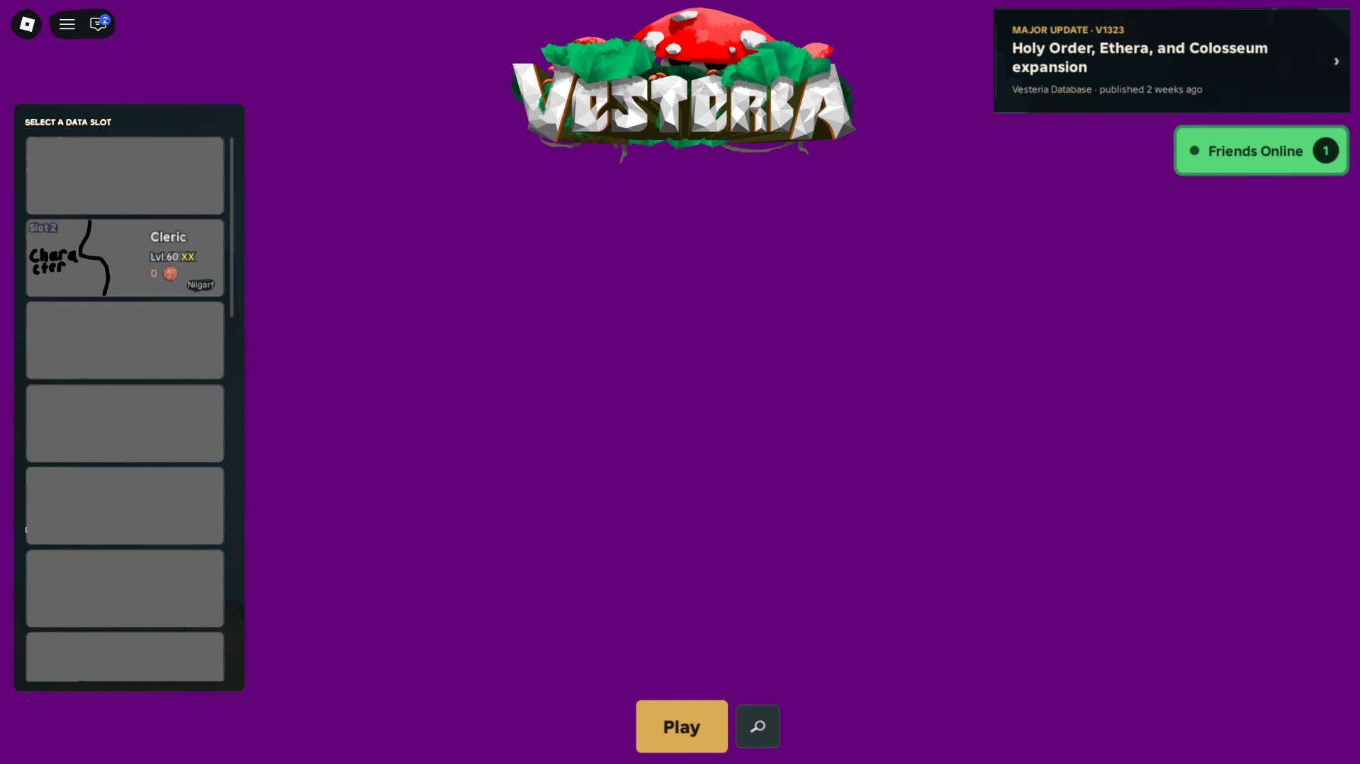
- Everything else is in the image
(moved slots up a bit, made the choose ur slot text white, increased size of class level and gold, moved slot whatever to the top left and added slot infront of the number (should be made smaller i didn’t mean to make it that big), changed the white vesteria logo to the old one, moved the database to the corner and put friends under it)